When I went into designing this level, the first thoughts that went through my mind were "Oh my word, I'm actually going to make something look amazing in a game engine." Looking back on where I started, I'd say I screwed up a few times along the way. From the size of the level to the texturing, I think I did my fare share of guess work. I found it rewarding making not just the modells and textures, but also the terrain, the particle effects (especially that laser). I found myself going through every possible idea when it came down to the characters. To truth, I actually hated creating the characters. Not because I HAVE to make them. It more comes down to the fact that I build their backstory and everything else in my mind after I talk about them. It's irritating, but it can let me create a bigger picture, and a better image if it ever came down to modelling those three. I never really decided what I wante to do at the start. I found two completely polar opposite objects, and attmepted the impossible. It was a struggle, but a worthy struggle at that. I would happily come back in decades, no, years and make this game fully accessable for all to play. I would love to, but with my current skill level, I have a more to learn. As a wise man once said to me:
"You are never old until your stop learning"
And I never intend to stop.
Wednesday, November 9, 2011
Level Construction
Now that I have everything together, now it is time to place everything together. Without further ado, I hereby start puting the level together.
Doing this part of the level seems alot more rewarding then doing the modelling or the texturing. I get things thrown at me for saying this but, it seems more rewarding placing everything into position than just build everything piece by piece.
I sat down after working on it and realised one problem with my map: it's too small! In a scrambled effort to make it bigger, I tweeked a few things here and there and produced something bigger, not likely to be badder, but most deffinately give the player more hideing spots.
After forgetting to add rocks, I quickly and without any further need of panic added them in. Question is: can you honestly see them in this new and improved image?
Trees make the level loook more lively. There are ferns and grass alpha. Now for the stretch for the finish line! G.U.I. Here I go!
 |
| After about a good two hours of material fixing, I got it to here |
 |
| And this is with trees! More Trees! |
I sat down after working on it and realised one problem with my map: it's too small! In a scrambled effort to make it bigger, I tweeked a few things here and there and produced something bigger, not likely to be badder, but most deffinately give the player more hideing spots.
 |
| Spot the difference? I can |
 |
| Now with rocks? Can you see them? |
Trees make the level loook more lively. There are ferns and grass alpha. Now for the stretch for the finish line! G.U.I. Here I go!
Tuesday, November 8, 2011
Heads Up Display and Front
Alright... so with all games, there needs to be a Heads-Up Display (or H.U.D.). I looked at games like Assassin's creed due it's high immersion and sci fi feel. Just thinking it makes me want to play assassin's creed all over again.
So I sat down with me, my level and my brain, and smacked a nice and tasty H.U.D. for my game.
This is how it would look for the level. Note, in the top right hand side, a dial like device, notifies the player of what piano mode Noct. Currently. He is the soft music (Fade mode). The points numbered 1 -9 repressent the number of songs/music attacks that are slated to the hot keys. Customisation for what songs would be the player could use would be defined out of battle.
Now for a main screen which doesn't show anything about the level!
I know... it's snazzy, needs more neon lighting, but it blue is a calming colour. I chose the font "Hybrid" because it contains that neon sci fi feel that I want the level to contain. The colouring is the same in the level interface image above, because of its calming effect. The black background is used to make the neon stand out, and I stylised the buttons on the left to look like the F, G, A, and B keys from a standard keyboard.
| Minimal interface, maximum immersion, all while falling from a great high |
So I sat down with me, my level and my brain, and smacked a nice and tasty H.U.D. for my game.
 |
| Ah photoshop, thou art an image maker. |
Now for a main screen which doesn't show anything about the level!
 |
| This is the main screen... The font was made by Ola Björling (ola@techno.org) (I prefer to keep in the safe side of things |
Tuesday, November 1, 2011
Textures, textures, and tiling textures!
No game level is every complete without our beloved textures. To create what I'm after, I'll need tileable and mappable textures. TO GOOGLE AND PHOTOSHOP FOR TEXTURING! So we have a sci-fi building, and now we shall create a texture for it. I'm going to make something metalic, something dark... something... grim! I've found it a dark texture, now to allow it to be tilable.
 |
| Before |
 |
| After 20 tries, I landed with this |
It's irritating to get textures to work... espcially since I have limited luck with photoshop. So I crossed my fingers and made that blue neon (it looks dogy) texture from the neon Light texture
 |
| After I tweeked the glass |
 |
| Before I tweeked the glass |
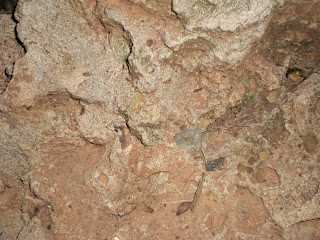 |
| Rock texture before |
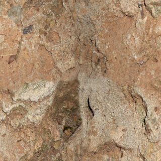 |
| Rock texture after |
 |
| Rock Texture 2 before |
 |
| Rock Rexture 3 after |
This texture I decided to use for most of the buildings. I didn't want something too simple, nor something too bland.
Friday, October 28, 2011
Alpha images, Particles Effects, sky boxs and Lens Flares
Ah, yes. The fun part! The one (make that multiple) thing that all games of the modern era contain is the beloved particle effects. Whether it be rain, fire or electrical spark, most games of the modern era have them. So... now to think: what am I going to do with you, my lovely particle effect. Well, let's make it rain, to give it more of a... darker and gloomier. This will create an atmosphere that is sure to make the level have the imagery and that emotion. I'll also utilise particle effects to create some laser beams.
Right... Alpha images, or in my case, jungle grass! That's right, grass. I've seen photos of grass all over the place, tough if you look in a jungle, there appears to be a limited amount. But non the less it does exist. I could pull off the ground off without the grass, but it wouldn't look one bit realistic.Though too much and your whole engine/computer can slow down unmercifully.
Now for sky boxes, oh the fun and joy. Because it's set in a forest, I don't want the sky box to be heavily visible. So, aiming for something along the lines of say... a cloudy day, make the task a bit easier. Because of the rain, I'll use a overcast skybox to give a greater reason behind the use of the particle rain.
Lens Flares give a sense of realism and a sense of being there in the game world. To make this game more realistic, I'd add in a sun based light flare. This should be a little more interesting due to the overcast sky, and you won't see that much of the sun, nor are there going to be any shiny objects.
| An example of rain not using the level I'm making |
 |
| A laser made purely from a particle effect... With a camera infront of it |
Right... Alpha images, or in my case, jungle grass! That's right, grass. I've seen photos of grass all over the place, tough if you look in a jungle, there appears to be a limited amount. But non the less it does exist. I could pull off the ground off without the grass, but it wouldn't look one bit realistic.Though too much and your whole engine/computer can slow down unmercifully.
| Ferns... pretty |
Now for sky boxes, oh the fun and joy. Because it's set in a forest, I don't want the sky box to be heavily visible. So, aiming for something along the lines of say... a cloudy day, make the task a bit easier. Because of the rain, I'll use a overcast skybox to give a greater reason behind the use of the particle rain.
 |
| This is a skybox. If you are bored, find the edges. Reward: Your own satisfaction |
Tuesday, October 25, 2011
Modelling - 2
Okay... now for some more moddeling. HOnestly, I'm finding modelling for this level a bit too easy. Then again, I'm good simple with my box modelling and things a such. I fel calm when modeling everything for this whole area, and it took about 20 minutes to settle everything.
I Felt a lot more satified with the modelling that I accomplished... but I feel like I can leave the rest to my texturing skills.
 |
| Just a few more models I didn't prepare earlier |
I Felt a lot more satified with the modelling that I accomplished... but I feel like I can leave the rest to my texturing skills.
 |
| At bit more modelling, and a bit more poly |
 |
| Insert rock 2 here |
 |
| Another Rock |
And so, that Is my modelling done, and now for a quick view of all the models minus the rocks
Now let's get some textures happening!
Friday, October 21, 2011
Modelling - 1
Ah... the joys of modelling. It's a good way to relax on any day, even though my skills are limted and have a long way to go. I thought I might share with you some of the in-game object that have ben modelled and are to be texture to look impressive.
 |
| Rock... Alright... let's rock.... |
First things first, I need to priorities
 |
| A very dodgy hand scanner |
 |
| From one box, I create a house... a pink drug lab house |
Most of my modelling techniques revolve around modelling from one object, such as a box, or a cylinder, or maybe a sphere if I'm game. The hand scanner took short period of time to model, due to the size and the amount of chamfering and sacling. It would have had to have been the most relaxing of the models to create. Considering the tedious
There are more to come in the not to distant future.
Thursday, October 20, 2011
Need Lights? Yes It does!
As with everything, we need lights... we need a camera... we... okay We may not need the dramatic action that we get on the big screen, but never the less I need some lighting occurring. Hence why I'm going to go about this from a simple perspective: the level is going to need light. First off the bat, let's use a pale blue directional light as the sun. Why use the blue directional light? Simple! Clouds provide a lesser density of light, which I'm hoping the particle effects will work in conjunction. Therefore I need a light source that would seem like it's going into a be a little bit darker. and most likely going to be a bit interesting, so i will have to use a particle effect to manufacturer the clouds.
Considering the art style, there will be parts glowing on buildings. I'll utilise it actually line parts with the textures, but use a low luminosity point lights at the edges and within an overlapping radius. This will act as a highlights and give the objects int eh game that greater sci-fi feeling.
Okay, now we have some decent lighting plans laid out, lets get some more pieces for the level sliding into place!
| This is the the kind of lighting I'm looking at for the world... |
| Models from Tron Evolution |
Tuesday, October 11, 2011
Let's block her up!
So, now that the blueprint is down, let's build it up! The method of choice: blocking the level out. This isn't that annoy, can be tedious.So what I'm looking at is trying to make the level objects in the level fit to scale.
Okay, so we shall start out with blocking out. Observe the before and after pictures!
 |
| Yep... that blueprint from the post before. It's back and in 3D |
Initial thoughts about the blocking in were "Fantastic, my Idea is going to look more low poly than an early
Blocking a level! Now higher resolution than Minecraft!
|
I know, it looks colourful, and bland, but this is what the level will look like without the terrain, textures, skyboxes and countless hours of modelling. And so we now turn to modelling and texturing... Stay tuned because next we are dealing with skyboxes, Lights, and lens Flares.
Blueprints and other funzies
Now to actually start building a game level and map the it all out. Although, I need to come up with the crazy gameplay mechanics that drive the levels' progression, and how the game feels.
When it comes down to gameplay, there are a few key elements, especially with Noct. His headset is the first and by far the most important mechanic. It may appear playing music into his ears, but it controls what kind of music he plays on his keyboard of light. For example, if he's listening to heavy music, his notes can damage, stun, or destabilize an enemy, where as soft music can put people to sleep, make him go in visible for a few seconds, or cause small distractions. There is one more: silence, which... well... let's just say, crazy stuff happens when the notes are played (think about what "flight of the bumble bee" could cause). Another key element is stealth. Although you have a light piano which makes noise, you have to be very careful about who you aim a song at, especially when you are trying to put a hoard of guards to sleep. and you don't notice the sniper who's wondering what the hell happened all his allies. This requires the player to be analitical of each situation, noting everything
Now what's the one thing besides game mechanics that are needed: Objectives. First of will be, get past the first set of guards without setting off alarms.The next will be the choice of killing, reasoning with, or knocking unconsious your old friend. This does change some objectives around, and give a reason for going back through this level. Anyway, the next, is disabling the guards in the area. Once again, that light keyboard will come in handy. Then we have the bit we have all been waiting for: killing Rex. Once again, the choice is up to you how you do it. Oh yeah, and then comes the great escape! Now, here is where it gets tricky, you have to (if you knocked her out) run back, pick her up and run to the final area (arround the corner from Rex's deseaced body). Upon entering the area, you will enter a quick time event, where the player will have to input the correct keys to land punches, kicks, and note combinations. If you let your friend live, you will be focusing on protecting her and killing the enemies.
Right... let's put this incoherent rabble together. Que a graphic!
Okay, rough idea here. If anyone can make sense of this sketch, great! This is a minor idea... let's get a better defined concept. So... I had to make the idea be a bit more refined, and hopefully place in a border that isn't just a simple line.The level will look a lot, lot, lot larger.
Okay, now... here isthe objectives layed out. Green represents the "Convince your friend" option, Blue is the "knock out" option, and red is the... you can guess what option it is.
Onto the next post! Blocking out!
When it comes down to gameplay, there are a few key elements, especially with Noct. His headset is the first and by far the most important mechanic. It may appear playing music into his ears, but it controls what kind of music he plays on his keyboard of light. For example, if he's listening to heavy music, his notes can damage, stun, or destabilize an enemy, where as soft music can put people to sleep, make him go in visible for a few seconds, or cause small distractions. There is one more: silence, which... well... let's just say, crazy stuff happens when the notes are played (think about what "flight of the bumble bee" could cause). Another key element is stealth. Although you have a light piano which makes noise, you have to be very careful about who you aim a song at, especially when you are trying to put a hoard of guards to sleep. and you don't notice the sniper who's wondering what the hell happened all his allies. This requires the player to be analitical of each situation, noting everything
Now what's the one thing besides game mechanics that are needed: Objectives. First of will be, get past the first set of guards without setting off alarms.The next will be the choice of killing, reasoning with, or knocking unconsious your old friend. This does change some objectives around, and give a reason for going back through this level. Anyway, the next, is disabling the guards in the area. Once again, that light keyboard will come in handy. Then we have the bit we have all been waiting for: killing Rex. Once again, the choice is up to you how you do it. Oh yeah, and then comes the great escape! Now, here is where it gets tricky, you have to (if you knocked her out) run back, pick her up and run to the final area (arround the corner from Rex's deseaced body). Upon entering the area, you will enter a quick time event, where the player will have to input the correct keys to land punches, kicks, and note combinations. If you let your friend live, you will be focusing on protecting her and killing the enemies.
Right... let's put this incoherent rabble together. Que a graphic!
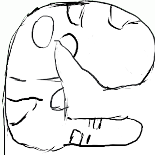 |
| Yeah... a blue print... I know... it's missing that blue background and the area looks like an unborn baby... |
Okay, rough idea here. If anyone can make sense of this sketch, great! This is a minor idea... let's get a better defined concept. So... I had to make the idea be a bit more refined, and hopefully place in a border that isn't just a simple line.The level will look a lot, lot, lot larger.
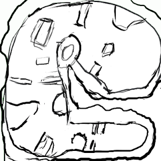 |
| A bit better in definition, but this my design. Looks small? Yes. Will it be small. YOU WISH! |
Okay, now... here isthe objectives layed out. Green represents the "Convince your friend" option, Blue is the "knock out" option, and red is the... you can guess what option it is.
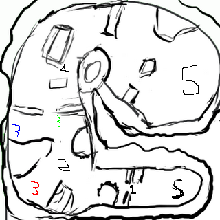 |
| Excues the poorly placed numbers, I was using a mouse |
Friday, September 2, 2011
Chapter 2 - Level design! GO, GO, GO! or was it make a game?
When making a game, it's generally a good idea to figure out your target audience and target platform. For this game project, I'll be aiming at late teenagers and fans of assassination based games. The platform of choice: PC. I looked at the consoles in comparison to the PC, and I found that with a PC, I could assign more keys for skills.
Okay... now to make a a level. First thing's first: Inspiration! Thanks to Google, and my mobile phone, I have pictures! Oh the wonders of having a camera in the phone ability and the dodgy as all hell quality. But none the less I already have some nice snap shots from the local area... of tafe. Okay, so let's make a jungle level and add a splash of sci -fi.
These images help me create a design that makes a very interesting, yet nature based world. So next up, concept art for the level.
I wanted something very Forest based, just still keeping a slight amount of sci-fi happening.
Now for the next important thing: characters are needed! okay, let's get three down:Noct, the musical assassin, Ami, a young guard for the forest lab and a friend, and Rex Mortum, the drug lord and owner of the forest lab.
 |
| A sci-fi forest courtesy of Google Images |
| Concept art for Guild Wars - Daniel Dociu |
Okay... now to make a a level. First thing's first: Inspiration! Thanks to Google, and my mobile phone, I have pictures! Oh the wonders of having a camera in the phone ability and the dodgy as all hell quality. But none the less I already have some nice snap shots from the local area... of tafe. Okay, so let's make a jungle level and add a splash of sci -fi.
These images help me create a design that makes a very interesting, yet nature based world. So next up, concept art for the level.
I wanted something very Forest based, just still keeping a slight amount of sci-fi happening.
 |
| Thumbnails: Don't worry, they looked a lot better on paper |
-insert final level concept art- (please wait a day or two before viewing)
Characters
Let's divulge on the hero of the game. Noct is an assassin that uses music to as a way to distract people, kill people, and a hand full of other things that does and does not involve people. The idea for the name came from the Latin words for Night (Noct) and music (Sanctus). He was inspired by characters such as Hei from Darker Than Black and Train from Black Cat. Noct is merciless but still acts a gentleman to the ladies. He used to work for Rex as a guard for now guard Ami, one of the multiple drug addicts. He slowly cut her addiction and sent her to violin lessons. When Rex found out, he asked for a simple explanation, and Noct stated he needed another musician to be around. This led to Noct being put on a literal suicide mission, which he survived, but was recruited by a government agency to become an assassin. he is no heading to the forest labs, two years after the the suicide mission to get revenge, save a friend, and cause havoc with music. He's about 180 cm tall, thin, but well built. He wears a pair of camouflage jeans, a black T-Shirt, black combat boots, and a neon glowing headset which is his primary weapon for creating music based combat.
When coming up with a female character (made her by choice) I really wanted to make someone who ha a dark past, but is a generally innocent character. Hence, I created (modelled (You know what I mean)) Ami Dollor (name derived from the words "amissis dolor" meaning "Lost smile" in Latin). She used to be guarded by Noct before the incident that made him turn against Rex. She still misses Noct, due to music he would play to her. She became a guard in the hopes of seeing him and hearing his music. My major influences for her are two of my friends, both who enjoy my music and rather make me sad. Her attire consists of a camouflage jacket and trousers, a white singlet, and camouflaged combat boots. She also wears a mood ring on her left index finger, and has her dark brown hair back in a ponytail. For a guard, this 175cm lady uses a photon katana. The general advice about handling the katana is, don't touch the blade.
And the final character: Rex, the boss of this level. He's a narcissist and a cruel son of a drug lord. He used to be on good term with Noct until he found out what Noct was doing and promptly sent him on a suicide mission. He is in the forest lab area to overlook some of the drug manufacturing. He's skilled with a revolver, but who knows if it is enough to save him from the growing sound of death heading his way. Seeing as he's a bad guy, you are going to kill him.. and you don't use/have a gun. I can't actually nail down an inspiration for this character, let alone a group. Though I created his ruthless and rather sadistic outlook on humans from a multitude of real life villains, mainly all the dark emotion that I usually have bottled up and release upon the video games I use to de-stress. Rex wears a white T-Shirt, brown pants, and black boots. His dark brown hair is slicked back with more grease then a sweat factory, and his eyes are small, but more green than evny itself. Though he may be 5cm taller than Noct, be warned that he at least holds a revovler in his hands at all times.
Next up, blueprints for a level!
Monday, August 8, 2011
Background of worlds with level desgin - Chapter one Q's
Through out all of the current education I'm going through to become a game designer, I decided to sit back and look at level design. By far it isn't simple, nor was it easy in the past. I mean, looking back into the 1980s, I got thinking of what kind of game I could have developed. With the limited amount of technology to play with, I'd be looking at something similar to space invaders or Galaga, so a top down shooter.
Looking at the time span of how long games have existed, a good manner of creating a better understanding as an up and coming game or level designer would be a great benefit for myself. So I looked at a few games, mainly Super Mario bros, Age of Empires, and Guild Wars. To me, I picked up the obvious pointers: all three where from different genres and had different amounts of graphical power. Super Mario Bros featured the old 8-bit colour, Age of empires featured "low end" of modern day graphics, and Guild Wars, with a relatively modern graphics. All the games feature their different gameplay systems thought their environment, if that makes any logical sense. For example, S.M.B. has eight bit platform levels where you have to jump on, throw fireballs, and dodge the occasional shell you kicked for fore, where as Guild wars has vast open areas for players to explore, kill creatures, collect loot, and be killed by creatures. The difference between games in phenomenal in comparison to both the way a level is set out to the gameplay that is involved.
Gameplay can detail out how a level is designed. Wait... it DOES give how a level should be designed. Three examples are BlazBlue Contium's stages, Etrain Odyssey II floors, and Call of Duty 4 Maps. BlazBlue stages consist of are a stationary background, a ground to match, both characters, and the UI displaying health bars. A good example of this would be Training room with a simplest design of lines and really gives the feel of a simulated world for training. Etrain Odyssey II levels are designed specifically for first person dungeon crawling (I'm pretty sure old school RPG players can remember the fun days of that). Luckily, you create a map on the touch screen screen of the DS. Without that, I would have lost myself within the labyrinth multiple times. They are set out as a "You objective is to find the stairs going down" method with the added fun of killing every creature that appears before you. Sure, it gets repetitive, but beating a boss at the end of each stratum (Five floors) sets a good rewarding feeling. Call of Duty maps are set out like all standard shooters: spawn points, flag points if doing capture the flag, and most importantly: enemy players to kill. Imagining fighting game containing dungeon crawling style levels bring a head ache to those pulling off a combo, let alone navigation.
okay, here is a summary of everything in this post, if I could make a game from the eighties, it would be a top down shooter due to the common trend, and their simplistic level design. Levels have evolved and not just from genre to genre, objective to objective, but graphically as well. From the days of 8-bit to the modern gaming era. A genre defines how levels should be set out, where NPCs should exist (or where they should not), and what can be sacrificed for the sake of a story-based game. Side scrolling fighters should not try to make a first person dungeon crawling level, and first person dungeon crawlers should mimic CoD. All in all, a genre defines how a game level should be constructed, and how is should influence the user's experience.
Subscribe to:
Comments (Atom)


