When I went into designing this level, the first thoughts that went through my mind were "Oh my word, I'm actually going to make something look amazing in a game engine." Looking back on where I started, I'd say I screwed up a few times along the way. From the size of the level to the texturing, I think I did my fare share of guess work. I found it rewarding making not just the modells and textures, but also the terrain, the particle effects (especially that laser). I found myself going through every possible idea when it came down to the characters. To truth, I actually hated creating the characters. Not because I HAVE to make them. It more comes down to the fact that I build their backstory and everything else in my mind after I talk about them. It's irritating, but it can let me create a bigger picture, and a better image if it ever came down to modelling those three. I never really decided what I wante to do at the start. I found two completely polar opposite objects, and attmepted the impossible. It was a struggle, but a worthy struggle at that. I would happily come back in decades, no, years and make this game fully accessable for all to play. I would love to, but with my current skill level, I have a more to learn. As a wise man once said to me:
"You are never old until your stop learning"
And I never intend to stop.
Wednesday, November 9, 2011
Level Construction
Now that I have everything together, now it is time to place everything together. Without further ado, I hereby start puting the level together.
Doing this part of the level seems alot more rewarding then doing the modelling or the texturing. I get things thrown at me for saying this but, it seems more rewarding placing everything into position than just build everything piece by piece.
I sat down after working on it and realised one problem with my map: it's too small! In a scrambled effort to make it bigger, I tweeked a few things here and there and produced something bigger, not likely to be badder, but most deffinately give the player more hideing spots.
After forgetting to add rocks, I quickly and without any further need of panic added them in. Question is: can you honestly see them in this new and improved image?
Trees make the level loook more lively. There are ferns and grass alpha. Now for the stretch for the finish line! G.U.I. Here I go!
 |
| After about a good two hours of material fixing, I got it to here |
 |
| And this is with trees! More Trees! |
I sat down after working on it and realised one problem with my map: it's too small! In a scrambled effort to make it bigger, I tweeked a few things here and there and produced something bigger, not likely to be badder, but most deffinately give the player more hideing spots.
 |
| Spot the difference? I can |
 |
| Now with rocks? Can you see them? |
Trees make the level loook more lively. There are ferns and grass alpha. Now for the stretch for the finish line! G.U.I. Here I go!
Tuesday, November 8, 2011
Heads Up Display and Front
Alright... so with all games, there needs to be a Heads-Up Display (or H.U.D.). I looked at games like Assassin's creed due it's high immersion and sci fi feel. Just thinking it makes me want to play assassin's creed all over again.
So I sat down with me, my level and my brain, and smacked a nice and tasty H.U.D. for my game.
This is how it would look for the level. Note, in the top right hand side, a dial like device, notifies the player of what piano mode Noct. Currently. He is the soft music (Fade mode). The points numbered 1 -9 repressent the number of songs/music attacks that are slated to the hot keys. Customisation for what songs would be the player could use would be defined out of battle.
Now for a main screen which doesn't show anything about the level!
I know... it's snazzy, needs more neon lighting, but it blue is a calming colour. I chose the font "Hybrid" because it contains that neon sci fi feel that I want the level to contain. The colouring is the same in the level interface image above, because of its calming effect. The black background is used to make the neon stand out, and I stylised the buttons on the left to look like the F, G, A, and B keys from a standard keyboard.
| Minimal interface, maximum immersion, all while falling from a great high |
So I sat down with me, my level and my brain, and smacked a nice and tasty H.U.D. for my game.
 |
| Ah photoshop, thou art an image maker. |
Now for a main screen which doesn't show anything about the level!
 |
| This is the main screen... The font was made by Ola Björling (ola@techno.org) (I prefer to keep in the safe side of things |
Tuesday, November 1, 2011
Textures, textures, and tiling textures!
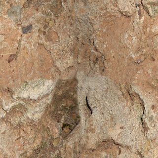
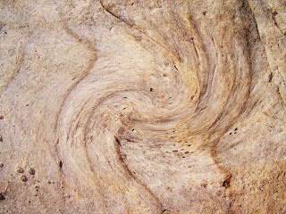
No game level is every complete without our beloved textures. To create what I'm after, I'll need tileable and mappable textures. TO GOOGLE AND PHOTOSHOP FOR TEXTURING! So we have a sci-fi building, and now we shall create a texture for it. I'm going to make something metalic, something dark... something... grim! I've found it a dark texture, now to allow it to be tilable.
 |
| Before |
 |
| After 20 tries, I landed with this |
It's irritating to get textures to work... espcially since I have limited luck with photoshop. So I crossed my fingers and made that blue neon (it looks dogy) texture from the neon Light texture
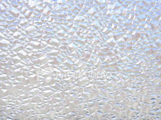 |
| After I tweeked the glass |
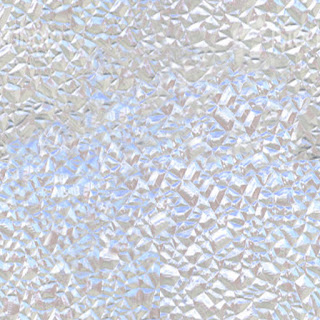 |
| Before I tweeked the glass |
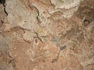 |
| Rock texture before |
 |
| Rock texture after |
 |
| Rock Texture 2 before |
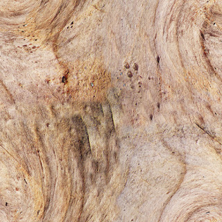 |
| Rock Rexture 3 after |
This texture I decided to use for most of the buildings. I didn't want something too simple, nor something too bland.
Subscribe to:
Comments (Atom)
